


Google’s switch to mobile-first indexing has reached its final chapter. Since Google’s initial focus on mobile devices in 2015, it has steadily prioritized mobile experiences for users. This means Google is primarily using smartphones to get a taste of websites, not computers.
This is not necessarily a panic-inducing announcement as most websites should already be good to go. But, if your site is a bit stale or crumbly on mobile, it’s time to add some sugar. Google wants websites that are fast, easy to use, and look great on small screens.
Mobile-First Indexing: How It Impacts Your Website
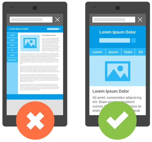
Mobile-first indexing means Google looks at the mobile version of your website first for SEO purposes and decides where to rank it in search results. This shift reflects the increasing reliance on smartphones for internet access. So, if your site is not a delicious digital treat when viewing it on a phone, it might as well be invisible.
The Final Stage of Google Search Mobile-First Indexing
Google has announced that the final phase of its mobile-first index migration has been completed as of July 5, 2024. Now, any sites that the desktop Googlebot previously crawled will exclusively be crawled using the mobile Googlebot. If your site can’t handle the mobile taste test (AKA isn’t accessible or functioning correctly), it will likely disappear from search results.
Important Note: Most websites are already sweet enough to pass the test and will not be affected by this change. Google has clarified that only a small subset of sites were being crawled by the desktop Googlebot. For many websites, this final phase represents more of a formalization of existing practices rather than a significant shift.

The Mobile Taste Tester: Googlebot Smartphone
Googlebot Smartphone is the crawler used by Google to discover and index content on mobile devices. It’s like a tiny robot that pretends to be a human and tries out websites on a phone. This allows Google to accurately assess a website’s mobile-friendliness and provide relevant search results to mobile users.
Making your website mobile-friendly not only improves the user experience but also sweetens your chances of showing up in Google search results.
Sweeten Your Business with Mobile Optimization
A mobile-friendly website is a must for reaching customers. It makes the user experience sweet, satisfying, and keeps them craving more. When people are on their phones, they want information fast. A slow or clunky website will send them packing.
So, here’s what you can do:
- Conduct a Mobile Audit: Evaluate your website for any mobile mix-ups, and identify areas for improvement.
- Ensure Mobile-Friendliness: Optimize your website for smaller screens, fast loading times, and easy navigation.
- Optimize Content for Mobile Search: Create tasty content tailored to mobile users and incorporate relevant keywords.
- Test Mobile User Experience: Regularly assess your site’s performance on different mobile devices and operating systems.
Businesses that invest and focus on mobile optimization can enhance user experience, boost conversions, and improve search engine rankings.
Mobile Optimization for Delicious Results
The final phase of Google’s mobile-first index is the icing on the cake in the evolution of search. While many websites have already adapted, maintaining a strong mobile SEO strategy will help businesses delight their mobile-centric audiences. As a bonus, as mobile technology continues to advance, with trends like voice search and micro-moments gaining prominence, a strong mobile foundation will help businesses remain competitive.
Remember, a mobile-friendly website is no longer an option; it’s a necessity. It’s time to let cyberlicious® make your website irresistibly mobile. Schedule a discovery call to see how we can make it happen.