What is Website Design & Development?
Website design and development are two separate elements to generating a deliciously smooth online experience that entices visitors into taking action. In fact, we really should start thinking of websites as web applications simply due to all their capabilities today.
Website Design & Development
In a Nutshell.
Think of any website, or web app you periodically visit and all its features. Consider its interface; what you click, scroll, tap, flick, swipe, spread, and pinch. Think about what device you are using, and how the web app responds. There is a lot that goes into that, and the best companies in the business excel at designing great user-experiences (UX) by experimenting with many different types of user interfaces (UI).
Interested in some other popular website design & development FAQs?
- How Long Does It Take to Design & Develop a Website?
- How Much Does It Cost to Design & Develop a Website?
- What Should You Avoid When Developing a Search-Optimized Website?
- How to Design a Homepage & Website Layout
So, what is website design and development you ask? Maybe more than you could ever imagine:
WEB VS. NATIVE APP DESIGN
UX PROFESSIONAL DESIGN
UX PROTOTYPING SOFTWARE
UI PROFESSIONAL DEVELOPMENT
UI CODE
AESTHETICS
8 ELEMENTS OF DESIGN
10 PRINCIPLES OF DESIGN
WEB & WEB-SAFE FONTS
PROJECT GOALS: S.M.A.R.T.
HAND-GESTURE DESIGN
What is Website Design?
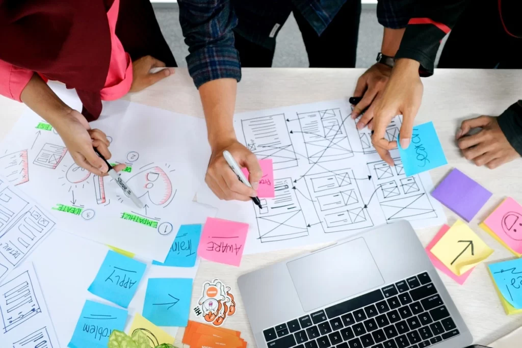
One half of a whole, website design refers to the creation of the visual elements of a website, such as the overall look and feel, user experience (UX) and user interface (UI).
A web designer’s objective is to create an interface that looks great, is easy to use, reflects the company’s brand, and appeals to the target audience. To achieve this goal, web designers are often responsible for crafting storyboards, logos, layouts, UI & UX designs, and color palettes.
In the end, there are a lot of moving parts. Let’s dig into some more details!
Web vs. Native Apps
When it comes to understanding what website design is, it is best to start with what type of application you are designing. Before mobile responsiveness was cool, we were building either web or native applications. As the technology advanced, some native app design features were implemented into web apps where we no longer required two apps.
What your organization will want will depend on what you need for your potential and returning customers.
Native Apps
If you want an application that utilizes smartphone features such as its GPS, accelerometer, camera, and other sophisticated features then a native app is your choice. You will want to find expert designers and developers in Android and iOS. If you have the budget, you will need to develop two applications for both operating systems since one size does not fit all.
Web Apps
Or websites, are specifically designed for internet browsers such as Chrome or Safari. Most businesses consider them billboards, do not measure them correctly, and treat them as an expense instead of capitalizing on them as an asset as the site depreciates. If you think a $10,000 website is expensive then wait until you learn how these “sites” make money. You will understand the complexity that goes into creating a customer converting machine.
User Experience Professional Design
A website must be designed with customers in mind. That is where UX Professional Design comes in. A website should flow and lead customers into taking action, whether that means they are making a purchase, reaching out to set up a consultation, or even just signing up for a newsletter. You want your website to be easy to use, accessible, and enjoyable at all levels of interaction.
User Experience Prototyping
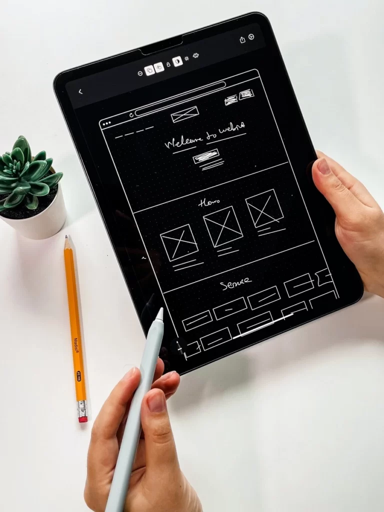
Designers can create protypes that show a barebones version of ideas. This allows designers to evaluate the usability of a design, gather feedback from users, and communicate ideas to clients or another party before greater detail and time is dedicated to the product or feature.
How do you know that feature will convert a customer? You should test that. Prototyping can allow professionals to test everything from layouts to features, as well as run experiments on different types of content and even call-to-actions. Feedback is important to the design process.
Aesthetics
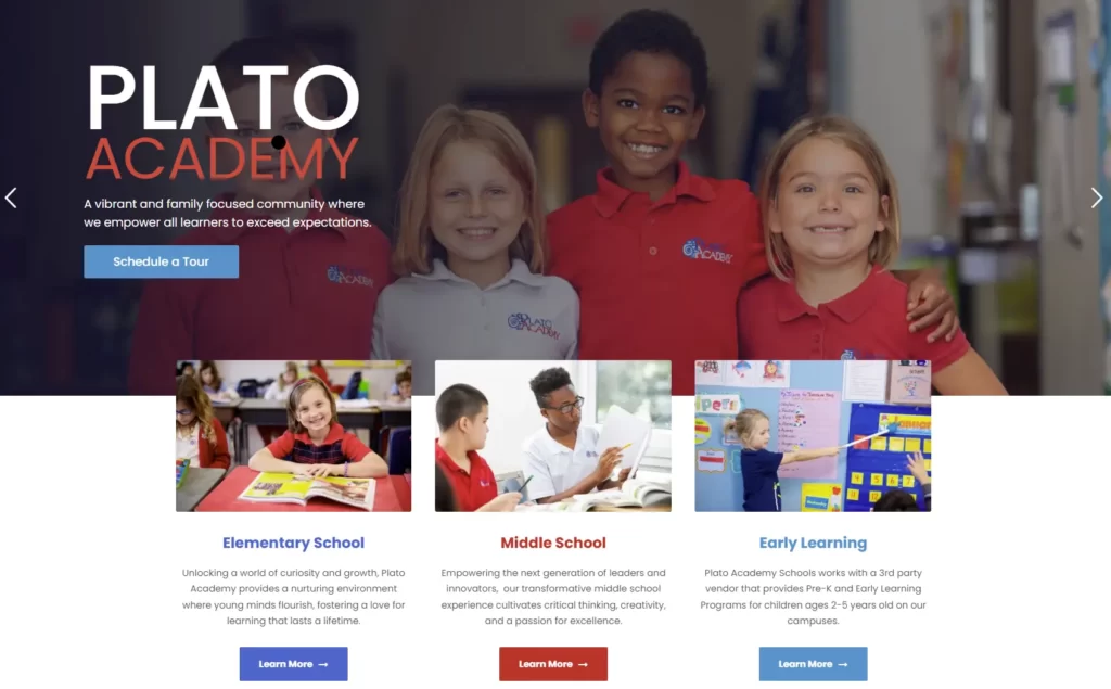
Customers want visual appeal. Brands need a voice, an identity. Your website aesthetics can help shape the way your potential customers view your business, brand, and products. Color pallets, fonts, minimalist vs. modern design, layouts, and more can all play a leading role in creating your brand image.
Just think, competition is fierce. Providing a customer with an experience from start to finish should be a top priority. Keep in mind what story your aesthetic tells. For example, if you are in the health and wellness business you may want your brand to show trustworthiness and healing. Additionally, brands in the adventure space may prefer a retro, quirky, and a down-to-earth vibe.
8 Elements of Design
There are 8 elements of design that all works of art and design follow. Without these elements art in any form would simply not exist. These elements are:
▼ Line
Lines are the most basic elements of design, and they can come in all shapes, sizes, and colors. They have direction; they can be straight or curved; they can be visible or invisible and can help direct the eye to a specific spot.
▼ Shape
The creation of shapes is an essential part of design, accomplished by enclosing lines to form boundaries. A shape’s color, form, and size can portray different moods and send messages.
▼ Color
Colors are extremely useful in design to create moods and help tell stories. Bring emphasis to an important message by using red. Give off calming vibes with the use of blue. The psychology of colors is a real thing.
▼ Texture
Adding a tactile sensation to any design layout can be achieved with textures. This gives users a more immersive experience, allowing them to feel as though they are part of the design.
▼ Space
Space is the area that surrounds a shape, or area between elements in a design. Abundant amounts of space, ‘AKA’ whitespace, can give off a clean and open feel. On the opposite end of the spectrum, not enough space can create clutter and confusion.
▼ Size
Size refers to the amount of room a feature takes up. Larger sizes place emphasis and draw attention, while smaller sizes may come across as less significant. Use sizes strategically to get a customer’s attention where you want it.
▼ Value
Values refer to the lightness or darkness of an element, and can be used to create contrast, depth, and visual interest. Use different values to create the illusion of movement, different moods, and more.
▼ Typography
Typography is how texts appear visually. The typeface chosen can make or break a composition, influencing the reader’s perception of the text. Not only that, but it can also create a certain atmosphere and evoke emotions.
10 Principles of Design
Website design requires finesse, and an understanding of what users want. Thankfully, there are 10 principles of design, that when used correctly, can help designers strike the perfect balance between text, content, media, and space. These principles are:
▼ Movement
Movement refers to the way that a user’s eye travels across a design. Lines heavily influence how movement is perceived.
▼ Contrast
Designers use contrast to create color palettes and can also be used to focus users on specific areas of a page. High contrast is when two colors are practically opposites, but they work together, like purple and orange. Low contrast is when two colors are close together and create a more uniform and peaceful balance, such as two different shades of green.
▼ Repetition
Repetition refers to the use of repeated elements on a page. In web design, this can be seen with the appropriate use of footers, sticking to specific color pallets, and even keeping a consistent typeface and font size.
▼ Variety
Yes, you want to keep a web design consistent, but having variety can ensure a better and more engaging experience for users. For example, all text on a webpage is boring. Adding images and other media help draw attention.
▼ Harmony
Harmony refers to the cohesiveness of elements throughout a website design. This can refer to everything from colors and content, to staying on brand.
▼ Balance
Balance is how everything on a page is evenly, or unevenly, distributed. An unbalanced page may lead to a poorer user-experience and make it harder for users to focus on the content.
▼ Proportion
Proportion is the balanced relationship between two or more elements of scale. For example, a company’s logo must have a proportionate text to logo ratio to look appealing to the eye.
▼ Rhythm
Rhythm is like movement, except with the use of patterns. It helps to create flow and order. Most websites are built on an invisible grid that helps evenly space elements out. Additionally, using consistent header sizes, fonts, and colors also helps keep rhythm.
▼ Emphasis
Emphasis is when you design elements that draw the attention of users. This principle is important particularly for call to actions and when highlighting specials, deals, or other time sensitive information. Have a specific action you want customers to take? Make it stand out.
▼ Unity
Unity is when the design comes together, and all elements work together to tell a story. This is where consistency, appropriate content, call to actions, and all other elements are designed with intention in mind.
Web & Web-Safe Fonts
Not every computer and browser have the same availability of fonts. When a user is not able to view the coded font, a default font is then used in place. While not a big deal in retrospect, in design however, the use of font can help shape the perception of what a user is interacting with. Therefore, there are ways to help ensure that a greater number of people see what is specifically intended.
▼ Web Fonts
Web fonts are fonts that are hosted on a remote server. Designers no longer need to concern themselves with whether a user has the right fonts installed on their computer, thanks to the availability of these remote-hosted fonts that can be loaded onto a website using CSS. This opens up an array of options for typography in websites, giving designers more creative freedom when it comes to choosing the perfect font for their project.
▼ Web-Safe Fonts
When it comes to creating websites, using a font that is universally available is essential. This is why the concept of ‘web-safe fonts’ has been developed; these fonts are pre-installed on most operating systems. So, this means when you use them on your website there is a good chance, they will appear correctly to viewers regardless of whether they have the font installed on their device.
Project Goals: S.M.A.R.T.
If you are in business, you have heard about S.M.A.R.T. goals. Well, the website design and development industry are no different! When starting a website design process, a discussion of your business goals is necessary to ensure that your website is designed to hit your goals. Your website is NOT just a billboard, in fact, it can be your biggest money maker. So, let us look at what makes a goal S.M.A.R.T.:
▼ Specific
A goal that is clear and unambiguous. Use the four W questions (What, Why, Who, Which) when figuring out what you want to achieve with your website.
EXAMPLE: I want my website to increase leads by 20%.
▼ Achievable
Be realistic. Compare your goal to current numbers; objectives set too high or too low become meaningless.
EXAMPLE: Creating an engaging user-experience with unique value propositions and more effective calls-to-action are projected to produce a 10% increase in lead flow. An additional 10% can be accomplished by driving traffic to the website through increased social media outreach efforts and SEO.
▼ Repetition
Repetition refers to the use of repeated elements on a page. In web design, this can be seen with the appropriate use of footers, sticking to specific color pallets, and even keeping a consistent typeface and font size.
▼ Relevant
Are your goals meeting the needs of your business, your mission and vision, or your stakeholder? If not, ditch it.
EXAMPLE: A 20% increase in leads is paramount to bringing in new opportunities for sales.
▼ Time-bound
Set a timeframe and keep it real. A new website does not mean you will see your goals met in the first week. Do you expect it to take 6 months? A year?
EXAMPLE: The 20% increase in website leads will start with an initial 10% resulting from the new website launch that can be realized 6 months from now. The other 10% will result from driving additional traffic to the website through improved social media efforts and SEO that will take at least another 6 months before producing results.
What is Website Development?
One other half of the whole, website development involves constructing the technical aspects of a website. This includes coding for the site’s functionality and creating back-end systems to store and process data.
A web developer’s goal is to make the web designer’s ideas come to life! While not as many moving parts, the coding alone can be very time consuming. So, let’s see why.
User Interface Professional
Creating a website that is both visually attractive and easy to use requires the expertise of a user interface (UI) professional. Website development involves designing a site wireframe which offers an intuitive experience for users, making sure all elements are in place for an enjoyable browsing journey.
Experience needed may include graphic design, website design, user experience (UX) design, and web development, otherwise, a team works together to bring all these elements to life. Overall, the user interface professional MUST understand the technical coding aspects that create a website.
User Interface Code
The code behind the visual design of a website or application is known as the user interface (UI) code. This code is integral for creating an aesthetically pleasing interface and includes specifications such as the layout, font choices, color selection, and interactive elements like buttons and menus.
When it comes to designing a website, HTML, CSS, and JavaScript are the three main programming languages used. This is what the developers see in the backend. HTML is responsible for the structure of the site, CSS determines its style and layout, while JavaScript adds interactivity.
Hand-Gesture Design
Hand-gesture design is a type of user interface that allows users to interact with a website using their hands. This extremely important part of development is especially necessary today with the number of people who use mobile devices and tablets to interact online.
Users swipe up, swipe down, zoom in, zoom out, and many more. These gestures would not be possible without particular coding. Furthermore, developers must consider the host of gestures an audience may like to use, the accuracy of the interface, the performance and responsiveness of the website, and ease-of-use.
Is Your Website Delicious?
The main goal of website design and development? To create an unforgettable experience for users. As you can see, it’s not just about putting information on a homepage. Skills, experience, and knowledge of website design and development are all required.
Guess what we do best? Deliver our clients websites that they fawn over. So, are you ready to take the leap with Cyberlicious® and create a website that is both beautiful and engaging?
